
Project on your mind?Let’s Talk
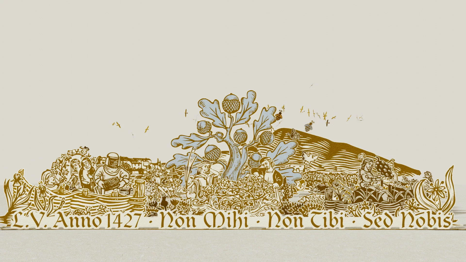
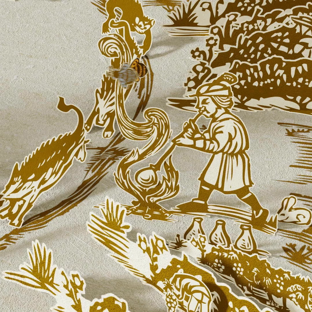
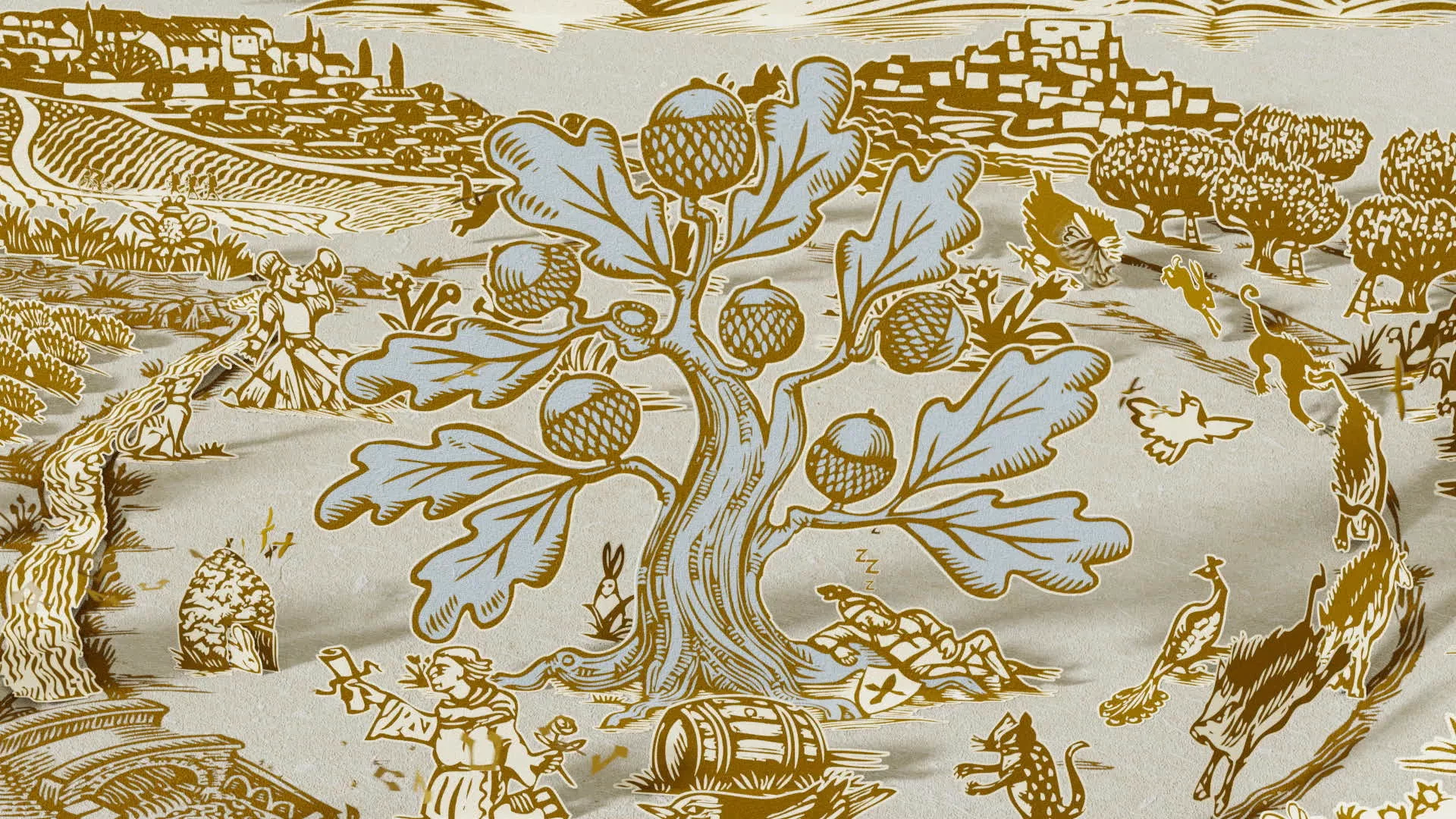
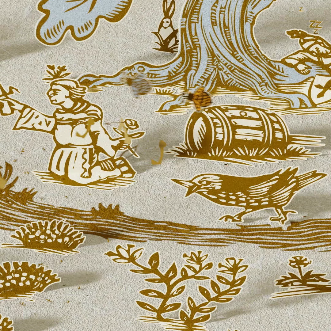
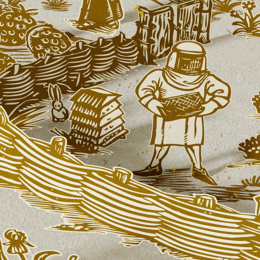
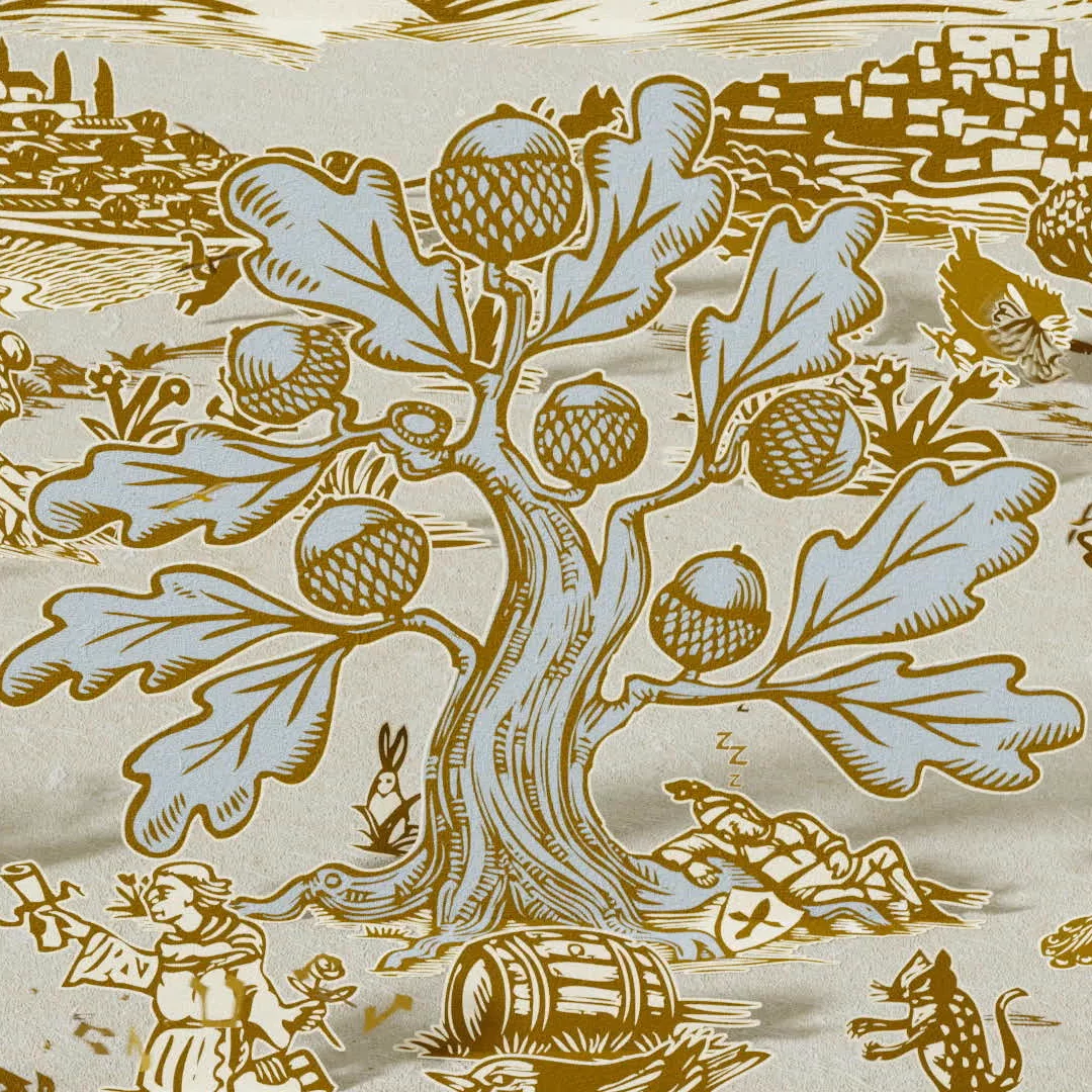
"From little acorns, mighty oaks grow" - The Chêne Bleu story, told their way


All in-house, all the time.
Every project is managed, planned and carefully crafted by an in-house team of creatives and developers, giving you direct contact with the people at the helm. We collaborate with clients, to bring visions to life.
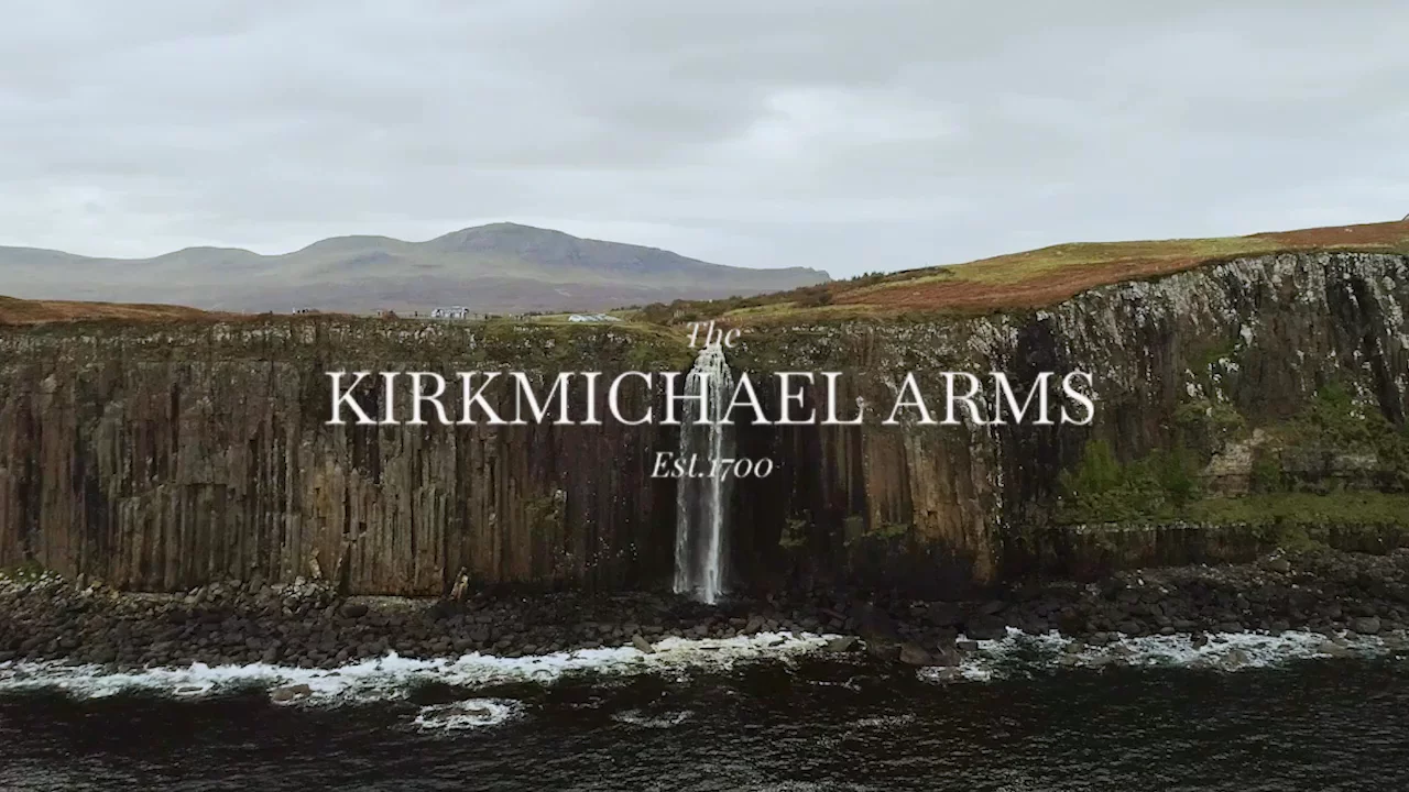
In the heart of Scotland - The playground of Robert The Bruce. A land of Lions, Legacy and Heritage. Of poets and Kings.

The UK's newest Three Michelin Star restaurant, Chef Patron Mark Birchall's imagination made real: a vision of what food, providence and respect for nature should be, built from extraordinary effort, deep knowledge, and a refusal to accept the ordinary.

"From little acorns, mighty oaks grow" - The Chêne Bleu story, told their way

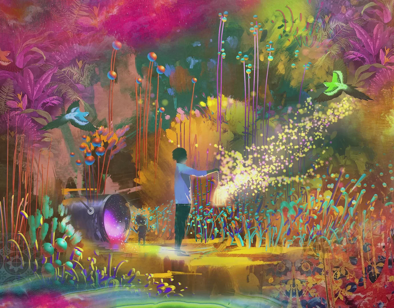
Launching drinks under the brand of a theatrical cocktail bar experience.
Legendary winemaker in California’s Napa Valley.
An exclusive winery on California's Sonoma Coast.

Heston Blumenthal’s iconic triple Michelin Star restaurant.

Indulging the imagination of a beautifully unique bar experience.

Moosh Bet on Us: How We Designed a Winning Vodka Brand

Manchester’s Icon of Indian and Pakistani cuisine.
Traditional Turkish food with modern appeal.

Instagram
@the_place_beyond
© Beyond 2024
BEYOND