Examples10 min read
Restaurant website examples: what the best ones get right

The short answer
The best restaurant websites each make one decision well for the guest in front of them. Moor Hall's website gives its restaurant, rooms and second restaurant one front door. The Fat Duck's puts booking before atmosphere. Maison Roux's was designed around film shot for it, and The Kirkmichael Arms' around photographs of the land its food comes from. Zouk's keeps its shop beside the booking button, and Incognito's speaks in the bar's own voice. Beyond designed and built all six.
Most lists of the best restaurant websites are a gallery of other people's work, with a line of praise under each. The writer can see what a site looks like. They can't know why it was made that way, or what happened afterwards.
These are sites we built, so we can tell you why each decision was made. Beyond is a studio of seven people in Southampton, and the six websites below belong to restaurants, pubs and bars we work with. Each is here for one decision you can copy, whoever builds your site. Every example links to the live website, so you can look for yourself.
If you would rather have the checklist, it is on our page about websites for restaurants. This guide is the examples.
Moor Hall: one front door for three things to sell
Moor Hall in Lancashire is a three-Michelin-star restaurant with guest rooms and a second restaurant, The Barn. Its old website had no single page that welcomed a guest and pointed them the right way.
We planned the new one around the question a guest arrives with: is this a dinner, a stay, or a more relaxed meal? The home page introduces the whole place first, then offers the restaurant, the rooms and The Barn, each with its own way in. Each has its own part of the site, and all three look like one place.
On your own site
- Count the things you sell.
- If it is more than a table, check that a first-time visitor can see every one of them on the home page without hunting.
The Fat Duck: booking first, character further down
The Fat Duck is Heston Blumenthal's three-Michelin-star restaurant in Bray, and we have worked with The Fat Duck Group since 2016. A restaurant this theatrical could easily open on a show and leave guests looking for the way to book.
We did it the other way round. The top of the home page is plain and practical, with Book a Table in the header and again under the opening lines. The character builds as you scroll. Further down, the page asks: "If a three-star chef inspired by Alice in Wonderland and Willy Wonka had a restaurant, what might it be like?"
The guest who came to book is served first. The guest who needs persuading gets more of Heston's world the further they go.
On your own site
- Open your home page on a phone. Can you book without scrolling?
- Then scroll on, and check that whatever makes your place different turns up before the page ends.
Maison Roux: film shot for the website, then cut again for phones
Maison Roux is Alain Roux's group in Bray: The Waterside Inn, Brasserie Roux, the Alain Roux Culinary School and the Alain Roux Boutique. People know The Waterside Inn. Fewer know the rest.
Here the film came before the design. We filmed for two days, from the pass to the river, then designed the website around the footage. The film opens the site. Below it, each part of the group has a chapter of its own, with a short reel and one button.
A wide film becomes a thin strip on a phone held upright. So the film is reframed to a taller shape on upright screens, and the venue reels were cut in that shape from the start. The home page plays six videos, so each one streams at the right size for the screen instead of downloading whole.
The two days of filming became the film that opens the website, a reel for each venue and more for social media. You can watch it in our Maison Roux case study.
On your own site
- Play your video on a phone held upright.
- If it is a small band with empty space above and below, ask for an upright cut.
- Shoot new film for the page it will sit on, instead of fitting old footage into a new design.
The Kirkmichael Arms: photographs of where the food comes from
The Kirkmichael Arms is a Michelin-listed pub in the village of Kirkmichael in Ayrshire, run by its chef and owner, Justin Galea. The cooking depends on what the land and sea around the pub produce, and plates photographed on a table couldn't show that.
So we spent three days outside as well as in the pub: lobster fishing, foraging for mushrooms and herbs, whisky tastings, and the cooking itself. We came back with more than 500 photographs. They were taken for the website, social media and print, so one shoot supplied all three.
On your own site
- Look through your photographs and ask what they show besides plates.
- A guest choosing between two places wants to see where yours is, who cooks and what the room is like.
A page for each thing people search for
The same pub shows a second thing. Few people search for a pub by name unless they already know it. They search for a meal and a place.
The pub's home page says what it is and where in its first heading: "A Michelin-listed restaurant and bar in Kirkmichael, Ayrshire". Its journal then has a page for each kind of search, with titles such as "The Best Sunday Carvery & Roast in Ayrshire" and "Dine At The Best Restaurant Near Troon". Each page answers one thing someone is typing into Google.
Website traffic rose 45% in the first three months, with the new website and the SEO work behind it.
On your own site
- Write down five things people might type to find a place like yours: a dish, an occasion, a nearby town.
- Then look for those words on your pages.
- If they aren't there, Google has nothing to show.
Zouk: the shop sits beside the menu and the booking button
Zouk Tea Bar & Grill serves Indian and Pakistani food in Manchester. It wanted to sell more than a table: gifts, experiences and ingredients.
We built the website with an online shop of its own, and designed the packaging for Zouk's spice tins and chutneys. The decision worth copying is where the shop sits. On Zouk's website today, Shop is in the header between Menus and Book, and it sells spice tins, gift sets and places on the restaurant's cooking classes.
On your own site
- If you sell vouchers, classes or anything in a jar, find the link to it.
- If it is only in the footer, move it up beside the booking button.
Incognito: the website talks like the bar
Incognito is a group of cocktail bars that began in Winchester, where every drink is served as a small show. A plain page of opening hours and cocktails would tell a guest nothing about the night ahead.
We have drawn Incognito's world since the bars opened, and its host is a character: Chadwick Smithfield, a mythical cat. He greets you on the website in his own words: "My name is Chadwick Smithfield and welcome to my humble abode." The same drawings are on the menus guests pick up at the bar, so the website and the room feel like one place.
The bookings website was also built to show guests' own posts as they were shared, so the people who had been could describe it too.
On your own site
- Read your home page aloud. Does it sound like the person who greets guests at your door?
- If the words could belong to any restaurant, rewrite the first three lines in your own.
Good looks are where it starts, not where it ends
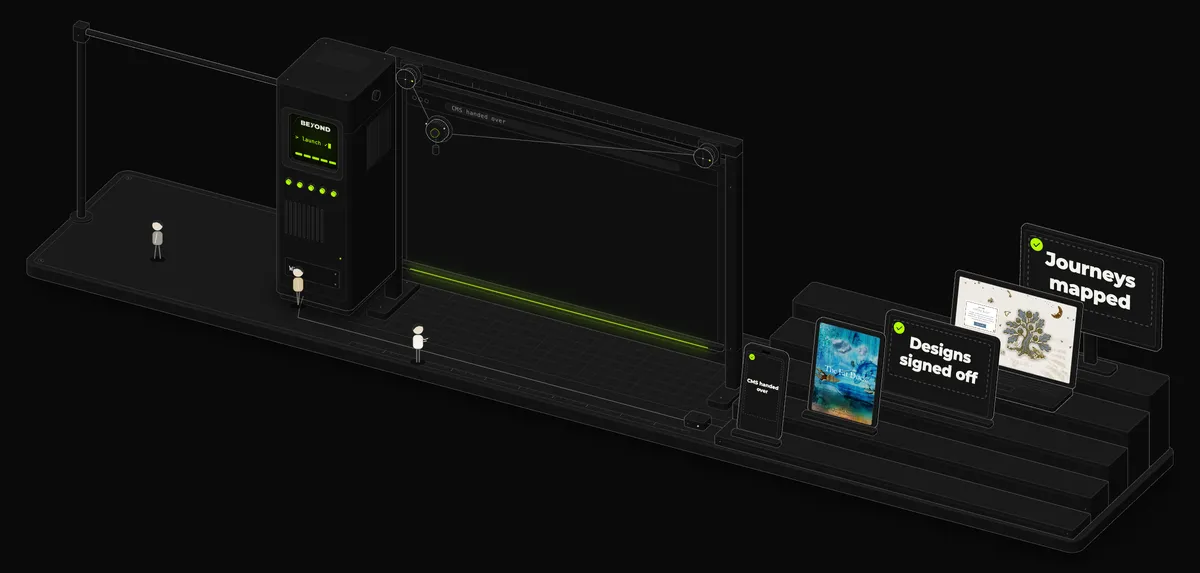
Each of these websites was designed to look like its restaurant. That is the part people notice, and plenty of studios can do it. The harder part is the work around the design: getting guests to the website, and getting the ones who arrive to book. A good-looking website that nobody finds, or that nobody books through, has not done its job.
Bring people in
Search, so people find you without a paid click. Ads for the searches worth paying for. Social media for the people who haven't searched yet.
Measure what they do
A website should be measured. We use PostHog to see where people arrive, where they give up, and how many go on to book.
Test a change
An A/B test shows half your visitors one version of a page and half another. The numbers pick the winner, not opinions.
Keep what works
The winner stays and the next test starts, so the same number of visitors brings more bookings.
Then round again, every month
What the six have in common
Moor Hall
Gives its restaurant, rooms and second restaurant one front door.
The Fat Duck
Puts booking before atmosphere.
Maison Roux
Was designed around film shot for it.
The Kirkmichael Arms
Was designed around photographs of the land its food comes from.
Zouk
Keeps its shop beside the booking button.
Incognito
Speaks in the bar's own voice.
None of these websites works because of a trick.
Each began with two plain questions: what does this guest need, and what is true about this place that no other restaurant can say?
The design followed from the answers. You don't need a studio to ask them. A template with good photographs and a clear booking link does the basics well, and our guide to what a restaurant website costs explains when that is enough. If your website has more to carry, our website design page explains how we work.
Questions
What makes a good restaurant website?
A good restaurant website lets a guest do what they came for quickly, then shows what makes the place different. In practice, booking is on the first screen, the menu is easy to read on a phone, and the photographs are of your own food and room. The Fat Duck's website does both: it opens on booking, then shows more of Heston Blumenthal's world further down the page.
What should a restaurant website include?
A way to book on every page, the menu as a page, opening hours, the address, and photographs of your own food and room. If you sell rooms, vouchers or products, each needs a clear link from the home page. Moor Hall's home page, for example, offers the restaurant, the rooms and The Barn, each with its own link.
What are some examples of good restaurant websites?
Six that Beyond designed and built: Moor Hall, The Fat Duck, Maison Roux, The Kirkmichael Arms, Zouk Tea Bar & Grill and Incognito. Each shows one decision worth copying, such as Moor Hall's single front door for its restaurant, rooms and second restaurant, or Maison Roux's film, which was shot for the website and cut again for phones.
How do I make my restaurant website stand out?
Say something only your restaurant can say. The Kirkmichael Arms built its look around the legend of Robert the Bruce and photographs of the Ayrshire land its food comes from. Incognito's website is hosted by Chadwick Smithfield, the same character who appears on its menus. A new typeface won't do it. A true detail about your place, shown in your own pictures and words, will.
Can I copy ideas from another restaurant's website?
Yes. Copy the decision, not the design. Putting booking first, giving the shop a place in the header or shooting upright film for phones will work for any restaurant. Another restaurant's colours, photographs and words won't, because they describe somewhere else.
Does a restaurant website need to be designed for phones first?
Yes. A page that only shrinks to fit a phone is hard to use, so plan the phone layout on its own. On Maison Roux's website, every chapter is laid out again for a phone: the logo, then the reel, then the words. Check your own site on a phone before you check it on a laptop.
Where to go next
Made by Beyond
Show us your restaurant's website.
Send us the address and tell us what it should do better. We'll reply within one working day and set up a free call with the people who'd do the work.
What happens next
- 1You'll hear back from us within one working day.
- 2We'll set up a free, no-obligation call with the people who'd actually do the work. Everything is made in-house.
- 3You get a clear proposal with scope, timeline and cost, usually within a week of our call.